
First Impressions Live in Color
Walk into any lively coworking hub, and you feel the psychological effects of colors long before you find the coffee machine. A bright coral wall nudges conversation, a cool slate nook invites focus, and the whole room quietly broadcasts that work is welcome here. For founders hunting Office space for rent, Noida side‑by‑side with freelancers grabbing an Open Desk, those early signals matter. They shape mood, teamwork, and—crucially—the impact of colors on productivity.
Why Hue Equals Output
Decades of research link palette choice to performance, confirming that the psychological effects of colors are more than décor trivia; they’re measurable drivers of output. A University of British Columbia study showed that creative problem‑solving rose in blue environments, while red sharpened detail‑heavy tasks. Good workspace aesthetics don’t just photograph well—they shorten project sprints and calm deadline jitters.
Inside a flexible floor plan, every zone carries its energy demand. Brainstorm corners compete with phone booths; a polished Event Space must spark sociability at 6 p.m. yet not distract programmers at 10 a.m. Thoughtful workspace color design resolves that tension, folding acoustics, natural light, and furniture into one visual‑psychological ecosystem.
Colors That Boost Different Kinds of Productivity
| Color | Documented Effect | Best Zone | Extra Tip |
|---|---|---|---|
| Sky Blue | Lowers heart rate, extends focus span | Coding pods, research desks | Pair with matte black fixtures to avoid “playroom” vibes |
| Leaf Green | Restorative, reduces eye strain | Open Desk clusters, long meetings | Add live plants to amplify biophilic calm |
| Warm Yellow | Elevates optimism, idea generation | Whiteboard walls, Event Space lounges | Keep to an accent; full yellow walls can glare |
| Deep Red | Heightens accuracy, urgent tasks | Accounts corner, bug‑fix station | Use sparingly—trim rails or desk dividers work best |
| Soft Neutrals (stone, taupe) | Anchors the eye, lets accents pop | Transitional corridors, reception | Layer textures—felt, timber, ribbed glass—for richness |
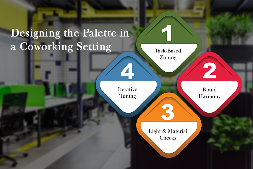
Designing the Palette in a Coworking Setting
Task‑Based Zoning
In Execube’s Sector 4 centre, we start with a function: intense focus, informal huddle, or public showcase. The palette then shadows the purpose. That functional sequencing keeps the impact of colors on productivity front and centre.
Brand Harmony
A cowork brand lives across newsletters, signage, and even lanyards. Your workspace color design must echo that identity while freeing members to overlay theirs, especially teams using Custom office solutions or branded cabins. Neutral backdrops with vibrant accent beams usually strike the balance.
Light & Material Checks
Pigment shifts under afternoon sun versus LED strips. Test swatches at different times; otherwise, the psychological effects of colors you planned at 11 a.m. may turn sour by 4 p.m.
Iterative Tuning
Survey members quarterly. Did the new terracotta phone booths reduce call fatigue? If usage dips, repaint. Color strategy, like seating, should stay agile.
Execube’s Color Playbook
At Execube, we treat hue like square footage—an asset to maximise. Our Custom office solutions team begins with workshops where clients pin mood boards, not spreadsheets. A biotech startup recently chose mint green partitions to ease lab‑adjacent anxiety; next door, a fintech cohort opted for steel blue to mirror user‑interface calm. Both cabins sit inside a larger neutral shell so community areas stay cohesive.
Meanwhile, the Event Space received a sunset gradient that fades from marigold to mulberry, ensuring Instagram‑ready panels without overwhelming daytime seminars. Across the hall, the all‑purpose Open Desk arena softens its industrial concrete with pale sage—gentle enough for solo work, still lively for impromptu stand‑ups.
We monitor KPIs—noise complaints, booking repeat rate, average session length—to verify the impact of colors on productivity rather than rely on anecdotes. So far, the data endorses the palette: churn is down and desk utilisation is up.
Quick Wins for Members
- Portable Pops – Can’t repaint? Bring in notebooks, mouse pads, or art prints in hues aligned to the psychological effects of colors you need that day.
- Color Sprints – Schedule creative meetings in yellow or orange zones; move detail checks to blue‑grey booths.
- Digital Sync – Match slide decks and dashboards to the room color to reduce visual fatigue.
- Green Breaks – Place mini succulents on your Open Desk; even micro‑doses of green refresh tired eyes.
Remember, the most potent workspace aesthetics combine comfort, acoustics, scent, and light. Color is the headline act, but the full show needs harmony.
Looking Ahead
Trends come and go—2025’s lilac moment proves that—but the core psychological effects of colors are steady. People still crave calm blues for deep work and optimistic yellows for launch huddles. As hybrid schedules blur home and HQ, coworking venues must double down on palettes that flex. Whether you’re scouting Office space for rent in Noida for a ten‑person scale‑up or testing Custom office solutions for a one‑week sprint team, choose environments where hue is deliberate, not accidental.
Ready to see color strategy in action? Book a tour of our Sector 4 centre today, explore the sunset‑washed Event Space, and spend a day at an Open Desk surrounded by productivity‑boosting greens and blues. Your next big idea might just start with the right shade.